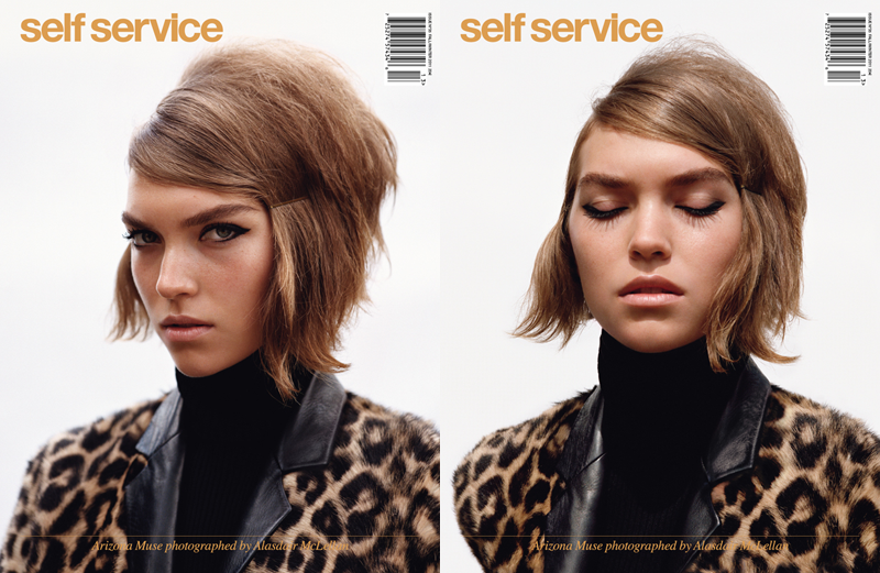
Above are some of my favourite looks from the ed. I can certainly see why so many people would be quite so head over heels for the editorial. The photography is of course phenomenal, but most of all the styling is pitch perfect. It's got sex appeal without looking sexy at all which I love. The slouchy, boxy, yet still tailored look is most definitely my cup of tea and is close to my ideal aesthetic for my wardrobe. It's probably quite trendy for now because the strong Céline and Prada stylistic influences everywhere nowadays but I can tell that I will still dress the same many many years down the road. Suzanne Koller is the stylist for the shoot and I absolutely loving all her work so far. Sorry Carine and Emmanuelle for picking new favourites! (well Emmanuelle not so much anymore...) A lot of her work is for Self Service so far so I wonder if she is also a fashion editor for Self Service? If anyone knows, please let me know. She is also the stylist for the latest A.P.C. F/W 2011, which I had admired when I was flipping through various other fashion magazines the past few months, and it all the more cements my love for this woman and her work. She was also the stylist for the next editorial featuring Claudia Schiffer, which I liked immensely and now know just why I like it so much. Strangely it's not circulated everywhere quite like the the first editorial even though it's just as impeccably styled. Although again, it was rather short even though it's so utterly chic.
Another favourite editorial is one styled below by Venetia Scott, who goes double duty as the photographer as well. Too talented much? Coincidentally she is the photographer behind A.P.C. F/W 2011 campaign as well. Again, she has a lot of editorial with Self Service, so perhaps she's also a fashion editor for the magazine. The pairing of Suzanne Koller and Venetia Scott is an absolute force to reckon with and I will most likely keep tabs on both of their work. I think the reason why I am so excited about these two is because I am quite disappointed with a lot of print magazines lately and fail to find much––if any at all––inspiration from editorials as I did in the past (the kind that you look at over and over again, and should the magazine fall apart at the spine from wear and tear, take it out and plaster all over the walls or in a scrapbook). I suppose I should save this for another post as there is much to talk about on the state of editorials (I suppose not really magazines themselves en général). The rebellious school girl theme from the first editorial continues down to this one. The strongest part of the editorials has to be the different colour combinations and the vintage silhouttes. The devil really is in the details here, all unmissable in the brooch and the retro hair and makeup. I find this equally as inspirational as the first editorial and yet again like the ed with Claudia Schiffer it's not sadly seen as much.
Moving on, a great feature of the magazine has to be the short and snippy Q&As with the who's who of the fashion industry, featuring the too cool (Pier Paolo Piccioli, one half of the duo behind Valentino) to the too pretty (Joseph Altuzarra, new CFDA fashion fund winner) and many more in between. I always love to know more about the designers themselves and the creative mindset behind the collection. For me, fashion is never 'just about the clothes', which is not that they are unimportant, but the aesthetics, the artistry, the ideologies and personal philosophies are all very much crucial as to why I like fashion so much.
There is still so much left of the magazine to be thoroughly discussed. The essentials Q&As are by far a trademark best of this magazine and the one with Jane Birkin for this issue was also wonderfully interesting (the mother of Charlotte Gainsbourg AND Lou Dillon!). I don't regret buying the magazine at all even though it's so pricey because the quality is absolutely amazing. The visuals of this magazine is impeccable and there are little ads in between to disrupt the flow of things (which could explain the price as we pay for parts of the production and publishing out of our own pockets). The only thing I wished the magazine had more of are articles. Maybe not the ones à la Vogue US or Paris even, but the in-depth profiles on the creative minds like the ones that Acne Paper does so well. Ultimately I do think the magazine is refreshing on how narrowly, and thus also strongly, concentrated the magazine is on on the fashion industry, unlike many others who veer often too much into different related creative industries like art or film, which makes Self Service unique on its own. I don't want to the magazine to lose its original flavour but with more articles, I'd be the happiest camper alive.


No comments:
Post a Comment
Thanks for reading and letting me know what you think! I read every single comment and I'll try to get back to you ASAP ;)
Note: Only a member of this blog may post a comment.